Color Theory
Color makes us feel things - in the places we live, work and play, and in our wardrobe too. What you wear matters in your branding and in your personal portraits - color is an under appreciated form of communication.
Color Theory looks into what colors work together best. Many learn this in art classes, and for those who didn't get that chance to learn, you can consult color wheels or tools online to see examples too. Adobe makes it really easy with web based tool too. You can use it to review analogous colors (colors near each other), or complimentary colors (colors that amplify and support each other), and more.
Usually only people in the art world or who work in an art background like Interior Design, Graphic Design, House Painters, and Personal Stylists to name a handful know what I'm talking about. So, when I'm asked what a client should considering wearing for their photography session, I start by asking questions.
These questions range from business owners: Do you have a logo for your business? What are the colors? What do you usually wear when you work with your client?
To personal portrait clients: Where are you going to use your photos? In print for a canvass on the wall or in your bedroom? What are you celebrating with your portraits?
The answers to the questions guide me in my answers and help clients feel empowered to decided on what to wear, what location or background is best for them. As I was thinking about this recently, I realized I have some wonderful photographs that show more than I can tell in sharing these ideas!
Here I'm sharing and showing some color theory in this post. I find nature to show us really strong complimentary colors in action. And, I want to make a note on culture - different cultures around the world view colors differently and they hold different meaning based on those backgrounds. For example, white in America can symbolize purity and newness, but in another symbolizes death. These notes are from my own experience in American culture.
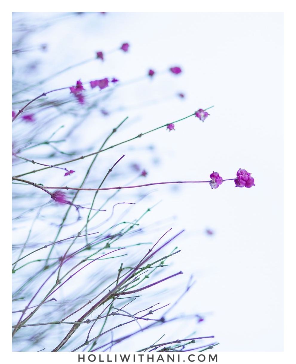
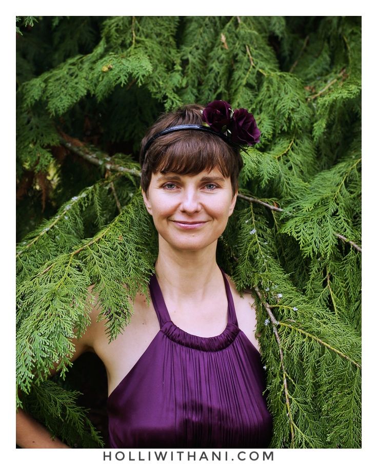
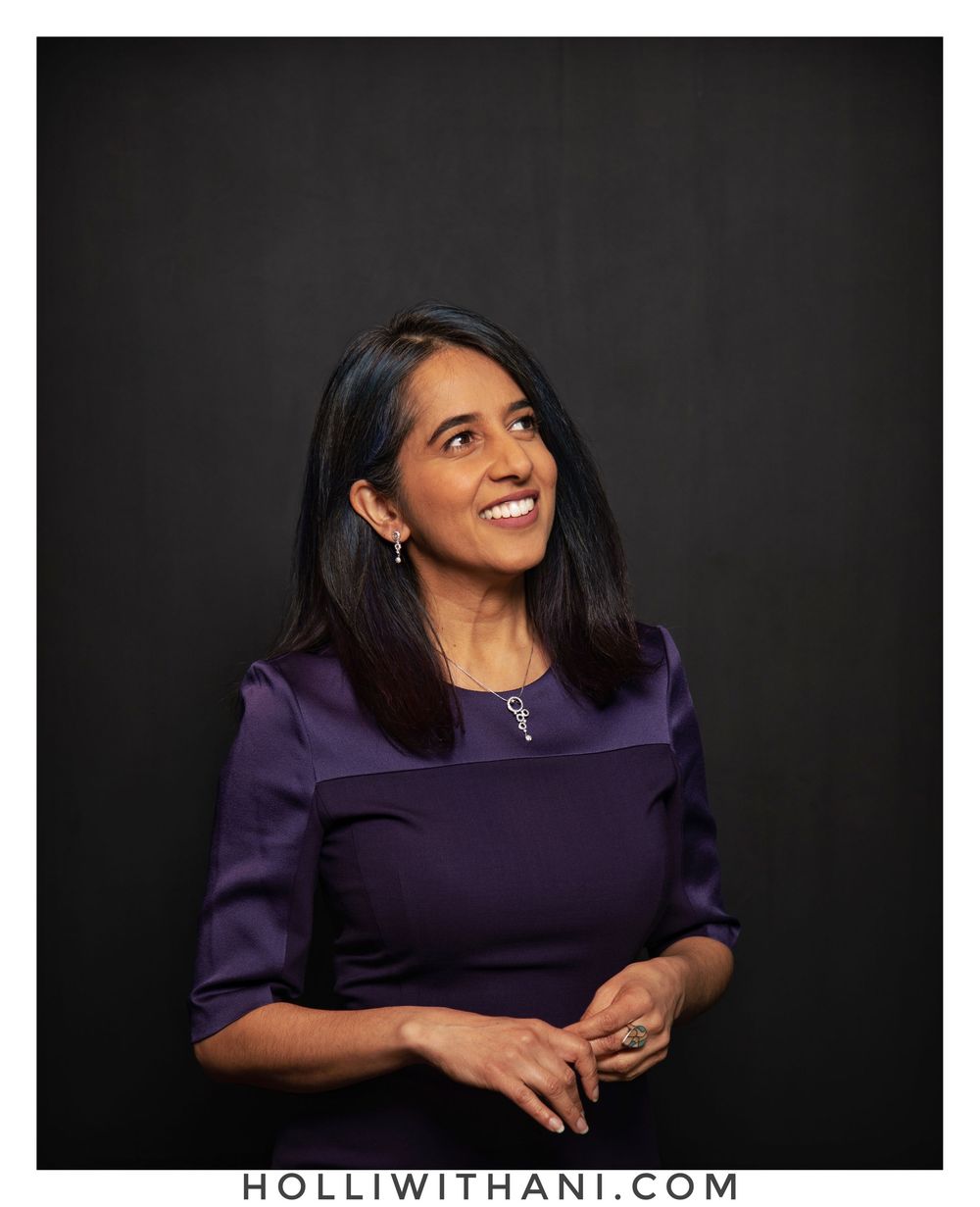
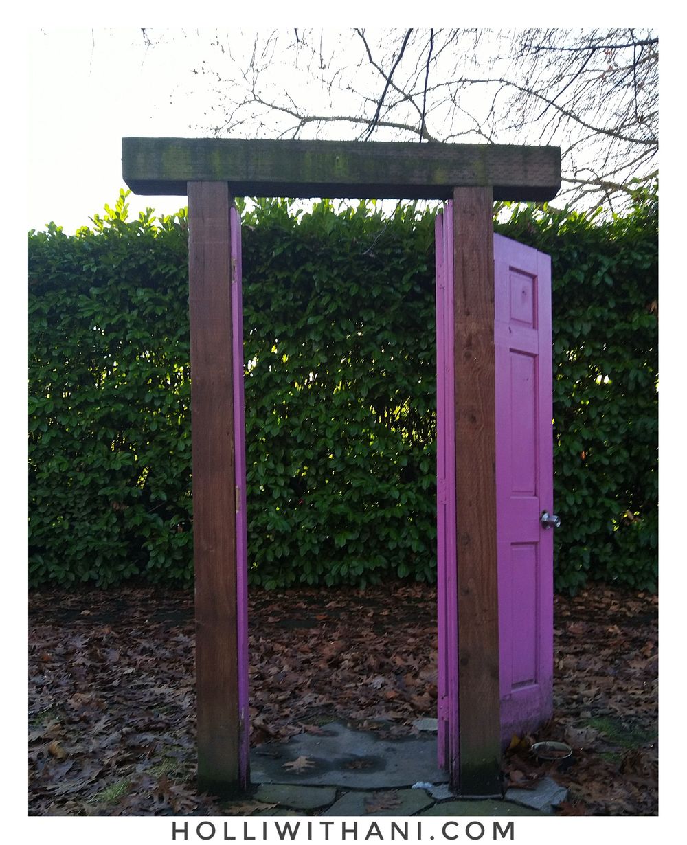
Purple - Play, Recognition, Individual
To share the feeling of purple and what I think it represents, I've put together a short collection of photographs I've created with nature and clients. This includes purple in a client's wardrobe choice or background too!


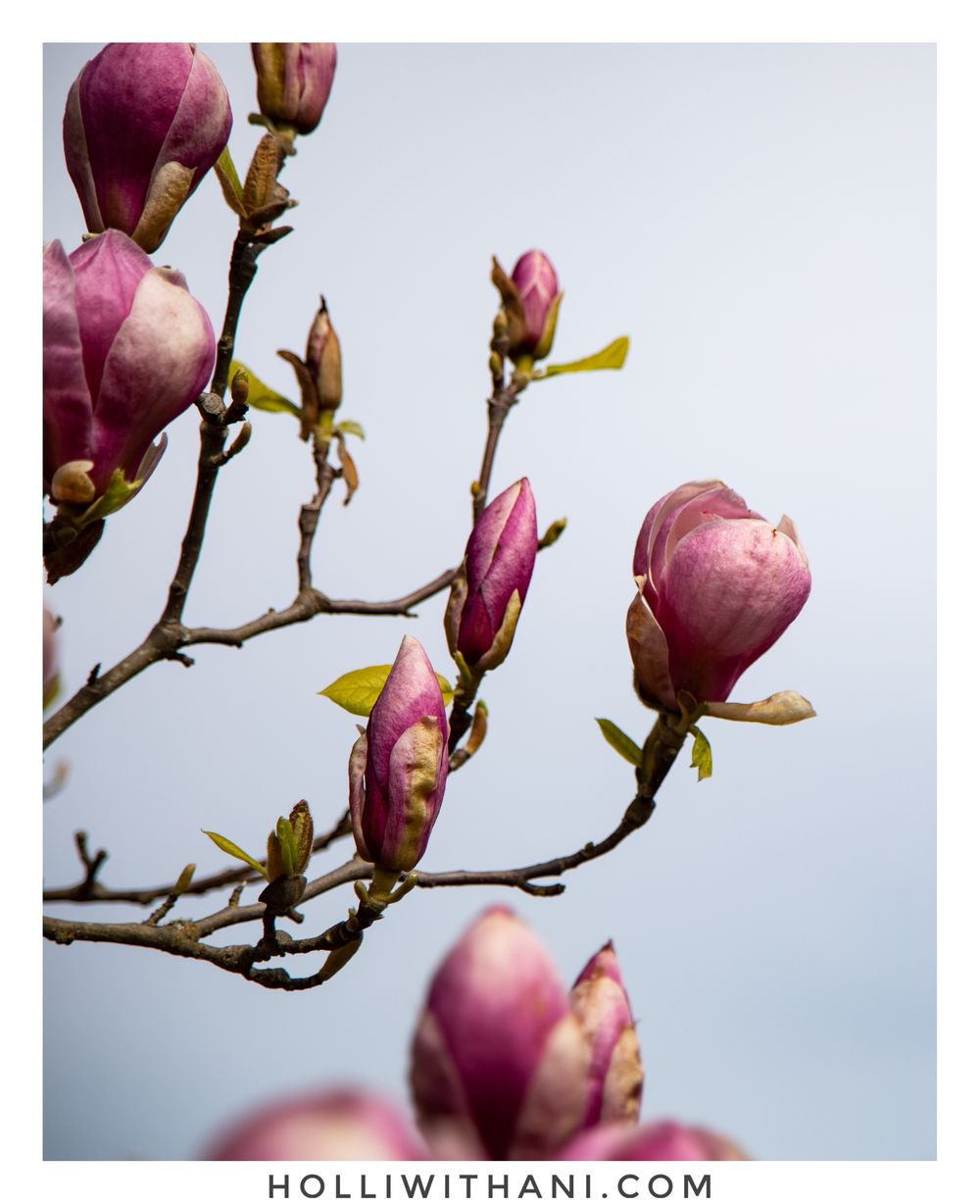
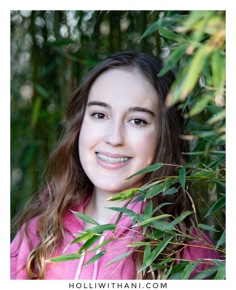
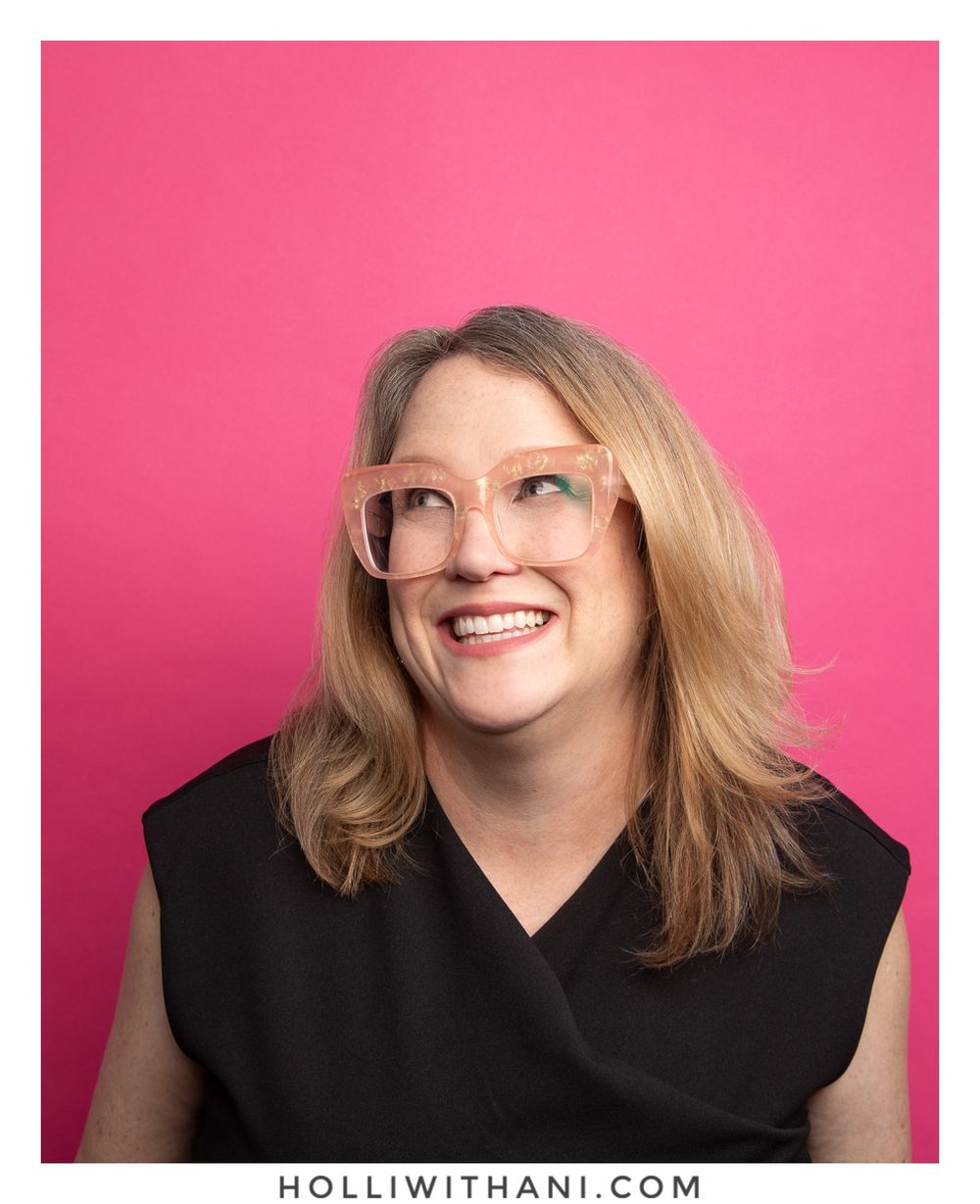
PINK - Gentle, new, celebration
When I see pink in nature, or in environments like paint on a building, or in what people wear, it brings a senes of gentleness, newness and celebration to mind. The tones of the color pink adjust this too from soft to vibrant, see how the photos I've created below make you feel.


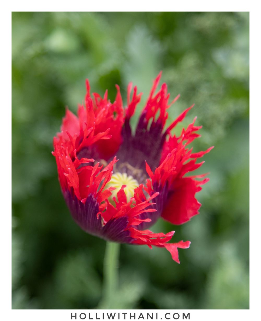
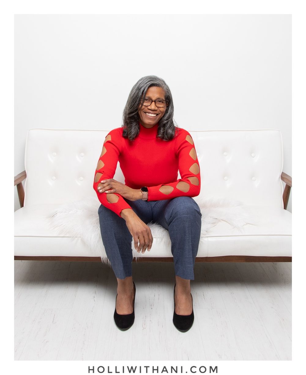
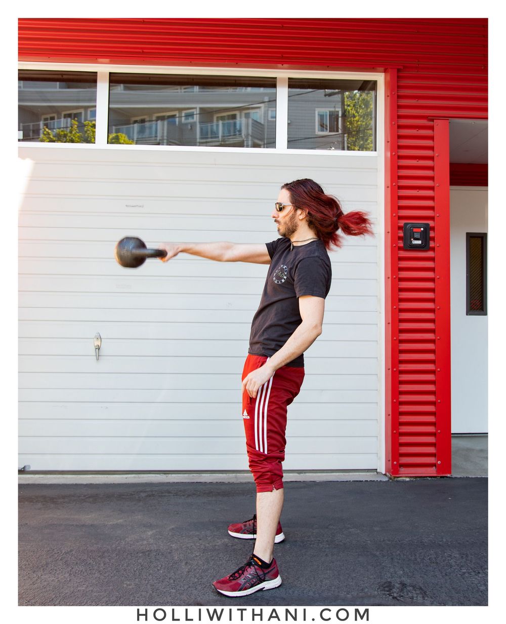
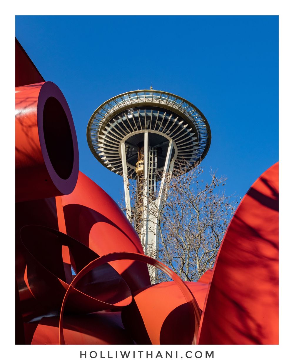
Red - Strength, boldness, Energy
Red is powerful! It evokes a sense of strength, boldness and celebration to my mind. When I see someone wearing red, they stand out. No matter the style of clothing, they attract attention. And it reminds me of flowers in nature, red is attractive to pollinators too - they attract energy! For companies and brands who use red, it's always fun to see the people wear red too.


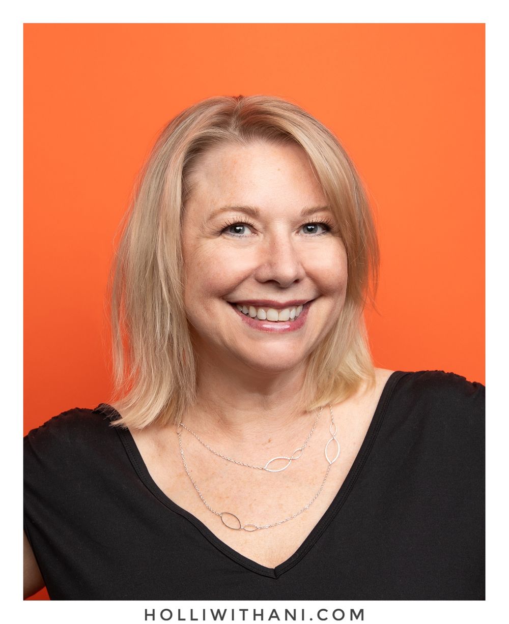
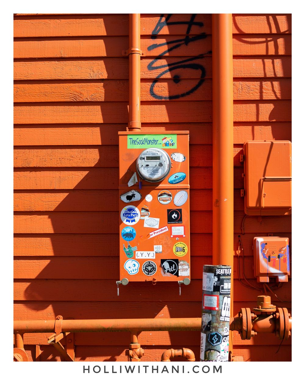
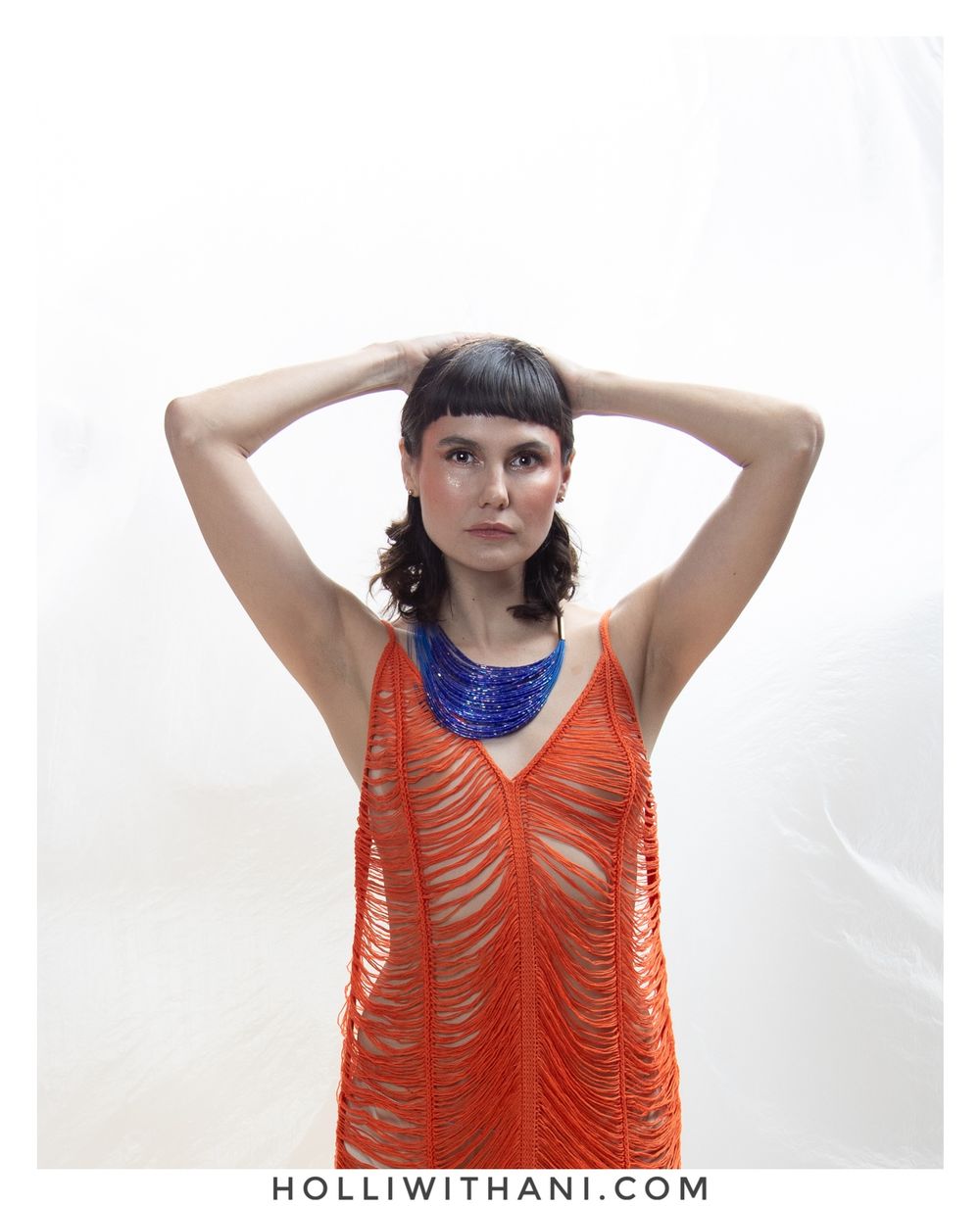
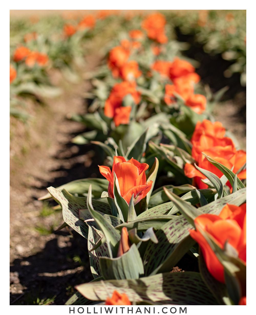
Orange - attention, unique, creative
When I see someone wear orange, they stand out like someone wearing red, but with a different vibe. Depending on the tone and style of their wardrobe, I see orange bring a sense of uniqueness and creativity. In the USA, we see orange used to alert us to road work or to keep people safe, so it's more utilitarian in our daily lives. I think that's why when it's worn on people, it leaves a creative and unique impression.


Yellow - Bright, youth, fun
Yellow is like a sister to Orange to me! It's also less commonly worn, but when it is, there is a sense of fun, and playful joy! I've not used it for a background beyond my own personal projects. The clients I have had the pleasure to photograph wearing yellow bring a variety of fun personality!


Green - Growth, Trust, Stability
This is one of the more popular colors I see in both wardrobe and background choices for portraits. I think Green brings a sense of trust and the positivity for growth into a photograph. The variety of tones that green can provide vary from serious to creative too!


Blue - Peace, Natural, comfort
Blue is the most popular color I see in wardrobe choices and backgrounds for portraits! I think because it's surrounds us in nature we feel comfortable with it, and the tones can vary as much as green too - from playful to peaceful. And that may be why it plays so well with green and yellow too!


